Drako Heart: A Bold Display Font for Impactful Web Headlines
There I was—midway through building a landing page for a boutique creative coaching brand—when the hero section felt flat. The client wanted “mysterious but magnetic,” something that whispered intrigue without shouting. I’d tried three clean sans serifs, two elegant serifs, and even a subtle script—but nothing landed with the quiet intensity they described. Then I remembered Drako Heart. I dropped it into the headline field, adjusted tracking, added a soft dark overlay behind the background image, and… yes. Instant gravity. That’s how I discovered what makes Drako Heart more than just another display font—it’s a deliberate tone-setter for digital experiences.
A Typeface Built for Visual Hierarchy—and Emotional Resonance
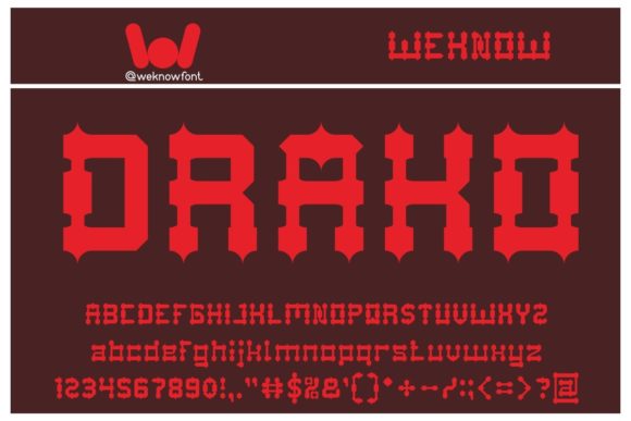
Drako Heart is a premium display font with thick, confident letterforms, sharp angles, and a subtly asymmetrical rhythm that feels both hand-carved and digitally precise. It’s not “scary” in a cartoonish way—its drama comes from weight, contrast, and intentional imperfection: slightly uneven stroke endings, a touch of organic tension in the curves, and generous spacing baked into its design. As a web designer, I appreciate that this isn’t just aesthetic flair—it serves function. On screen, Drako Heart commands attention without sacrificing legibility at larger sizes. It works best where you want users to pause, absorb, and feel—like a headline over a moody hero image, a section divider on a portfolio site, or the bold title on a limited-edition course sales page.
How It Performs Across Real Layouts
I tested Drako Heart across several responsive scenarios: desktop hero sections, mobile navigation headers (as a decorative logo lockup only), email banner text, and CTA buttons on a product landing page. Here’s what stood out:
- Desktop hero headlines: At 64–96px with 10–15px letter-spacing, Drako Heart held clarity even over textured backgrounds and subtle parallax effects. Its thickness prevented visual “disappearing” against busy imagery.
- Mobile previews: Scaled down to 48px on iOS Safari, it remained highly legible—though I avoided using it below 40px. No blurriness, no rendering hiccups. The font’s hinting and OpenType features clearly support modern browsers.
- Dark mode compatibility: Tested on a charcoal background with off-white text—no haloing, no contrast loss. Its robust x-height and open counters helped maintain readability where thinner fonts would vanish.
- Email clients: Embedded via webfont (WOFF2) in a custom-coded template, it rendered cleanly in Apple Mail and Outlook on Mac—but fell back gracefully to Georgia in older Outlook versions, thanks to thoughtful font-stack planning.
Where Drako Heart Shines—and Where to Step Back
This isn’t a workhorse font—and it shouldn’t be. Drako Heart excels in short, high-impact roles: main headlines, section titles (“Our Approach,” “The Ritual,” “Limited Access”), branded buttons (“Begin the Journey”), and stylized quotes in testimonial blocks. I used it beautifully as the sole typographic accent in a minimalist blog header—paired with Inter for body copy—and the contrast elevated the entire tone.
But I also learned where *not* to use it: never for body text, form labels, navigation menus (beyond a logo treatment), or anywhere requiring WCAG AA contrast compliance at small sizes. Its decorative nature means it lacks the neutrality needed for functional UI elements. And while it’s perfectly legible at 32px+, don’t try squeezing it into a 16px caption or a dense dashboard table—it’s a display font by design, not a utility typeface.
Smart Pairings That Elevate Your Digital Brand
Drako Heart thrives when paired intentionally. My go-to combination? Drako Heart + Inter (or any neutral, highly readable sans serif like Manrope or Red Hat Text). Inter’s open apertures and consistent rhythm create breathing room around Drako Heart’s intensity—making the pairing feel curated, not chaotic. For a more editorial or luxury-leaning site, I’ve paired it successfully with a refined serif like Cormorant Garamond (for pull quotes or subheads), letting Drako Heart hold the spotlight while the serif adds warmth and sophistication in supporting roles.
What made the difference in my coaching site project wasn’t just the font itself—but how thoughtfully it was layered: Drako Heart for the primary headline, Inter SemiBold for subheads, and Inter Regular for all body content and interface text. That hierarchy guided the eye, reinforced brand voice, and kept usability uncompromised.
Practical Considerations Before You Implement
Before dropping Drako Heart into your next site or client project, check a few key things: First, confirm it includes WOFF2 and WOFF formats—critical for fast loading and broad browser support. Second, verify commercial licensing covers web embedding (some display fonts restrict usage to desktop-only). Third, explore whether it offers stylistic alternates or ligatures—these aren’t essential for web use, but can add polish to hero text if your CSS supports font-feature-settings. Lastly, test multilingual characters if your audience spans languages beyond English—Drako Heart supports Latin-1 and basic diacritics, but doesn’t include extended Cyrillic or Asian scripts.
Drako Heart won’t solve every typography challenge—but when you need a headline that lingers, a brand moment that resonates, or a digital threshold that feels intentional and immersive, it delivers with rare confidence. It’s not background noise. It’s the first sentence of a story you want people to lean in and hear.