Boque: A Display Font That Lifts Digital Layouts
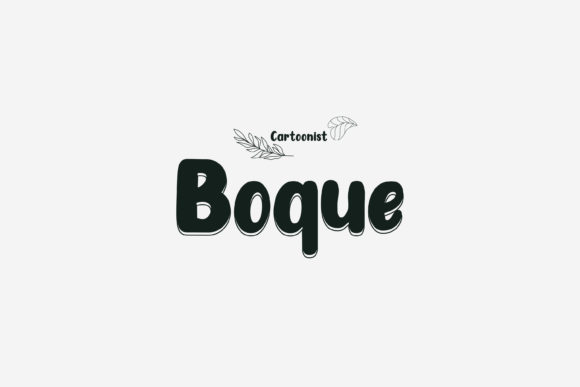
As a UI designer who ships landing pages, SaaS dashboards, and brand-forward e-commerce sites, I treat fonts like foundational design assets—not just decoration. Boque stands out in my display font library because it delivers expressive energy without sacrificing clarity or intention. It’s not a script or handwritten font; it’s a carefully crafted display typeface with bold, friendly letterforms, generous x-height, and subtle geometric warmth. The curves are confident but never cutesy, the spacing is open enough for screen legibility, and the rhythm feels intentional—like every character was designed to hold space on a retina display.
Boque thrives where visual hierarchy matters most: hero section headlines, product name treatments, CTA banners, and section dividers. On a coaching website, I’ve used Boque for the headline “Your First Breakthrough Starts Here”—set large over a soft gradient—and paired it with Inter for body text. The contrast works because Boque commands attention while remaining scannable. It doesn’t ask users to decode meaning; it invites them to feel momentum. That’s rare in display fonts, which often sacrifice usability for flair.
For online stores, Boque adds distinctiveness without alienating shoppers. In a boutique skincare shop, I applied it to category headers (“Vitamin C Serums”, “Overnight Masks”) and limited-time offer banners (“Flash Sale: 48 Hours Only”). Because Boque renders cleanly at 32–48px on desktop and scales well down to 28px on mobile (with proper line-height and letter-spacing), it maintains impact across breakpoints. On dark backgrounds, its medium weight holds up beautifully—no washed-out edges. Over imagery, I add a subtle semi-transparent overlay or use a light stroke to ensure contrast meets WCAG AA standards.
Readability isn’t about shrinking a font—it’s about context. Boque isn’t meant for paragraphs, navigation menus, or form labels. It shines in short, high-intent phrases: value propositions, feature titles (“Zero-Setup Analytics”), testimonial highlights (“Life-changing clarity”), or brand taglines. When used this way, it reinforces tone without competing with content. I avoid using it for buttons smaller than 16px tall—even with bold weight, fine details blur at tiny sizes. Instead, I reserve Boque for primary action headlines above CTAs set in a neutral sans serif.
Pairing Boque thoughtfully is key. My go-to is a humanist sans like Poppins or Manrope for UI copy—they share similar proportions and warmth but stay functionally invisible. For editorial or premium brand sites, I’ve paired Boque with a refined serif like Cormorant Garamond for subheads, letting Boque anchor the top of the viewport while the serif guides deeper reading. The contrast between Boque’s playful confidence and the serif’s quiet authority creates a balanced, memorable voice—especially effective for course sales pages or creative agency portfolios.
I’ve used Boque across portfolio sites where designers need to signal both craft and approachability. One freelance developer used it for their site header “Build Fast. Ship Thoughtfully.”—immediately communicating technical rigor and human-centered values. Another wellness brand applied it to Instagram carousel graphics and matching web banners, creating seamless cross-platform recognition. Consistency like that strengthens digital identity without requiring custom illustration or animation.
Boque includes standard OpenType features—ligatures, stylistic alternates, and multilingual support covering Latin Extended-A (including accented characters for French, Spanish, German, and Polish). That matters when designing for global audiences or multilingual SaaS tools. All weights are available as WOFF2 for optimal web performance, and the font files load quickly even on slower connections—critical for conversion-focused landing pages where every 100ms counts.
Licensing is practical, too. The commercial license covers unlimited websites, client projects, digital templates, and embedded use in web-based apps. That means if you’re selling Notion templates, Figma UI kits, or Shopify themes, Boque can be part of your core design assets—no per-site fees or attribution requirements. Just make sure you’re serving it via your own domain (not a third-party CDN) and respecting the EULA for app bundling or desktop use.
One thing I appreciate: Boque doesn’t try to be everything. It knows its role—as a display font, not a system font. That focus makes it reliable. You won’t reach for it to style a data table or error message, and you shouldn’t. But when you need a headline to land with warmth and distinction—on a podcast landing page, a newsletter signup banner, or the “About” section of a creative studio—it delivers with zero friction. It elevates without overwhelming, expresses without explaining, and supports brand voice without demanding attention away from content.
In practice, that means fewer revisions with clients who say “make it pop more” and more time spent refining interactions, flows, and conversions. Boque helps me communicate tone before the first sentence is read. And in digital experiences—where first impressions happen in under three seconds—that’s not just aesthetic polish. It’s functional typography.
- Best for: Hero titles, section headers, branded banners, short CTAs, logo lockups, social media cover graphics
- Avoid for: Body copy, small UI labels, long navigation items, dense tables, forms
- Pair with: Poppins, Inter, Manrope (sans serif) or Cormorant Garamond, Lora (serif)
- Responsive tip: Set min-font-size: 24px on mobile for hero use, and always test contrast on image overlays
- Licensing note: Covers websites, SaaS apps, digital products, and client work—no recurring fees